Renegade Public Forums
C&C: Renegade --> Dying since 2003™, resurrected in 2024!
Home » General Discussions » General Discussion » My Website templat (suggestions + mild flaming)
My Website templat (suggestions + mild flaming) [message #150679] Thu, 21 April 2005 01:23 Go to next message
csskiller is currently offline  csskiller
Messages: 522
Registered: April 2004
Karma: 0
Colonel
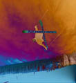
This is what I currently have for a template for my not yet hosted / unfinished website:
Here

Suggestions, Comments; Good, Bad, etc......


When history witnesses a great change, Razgriz reveals itself,
First as a dark demon,
As a demon it uses its power to reign death upon the land;
and then it dies.

However, after a period of slumber, Razgriz returns.
This time as a great hero...
My Website templat (suggestions + mild flaming) [message #150682] Thu, 21 April 2005 03:54 Go to previous messageGo to next message
idebo is currently offline  idebo
Messages: 390
Registered: October 2004
Location: Netherlands
Karma: 0
Commander
It's boring, you keep repeating it.
My Website templat (suggestions + mild flaming) [message #150686] Thu, 21 April 2005 05:13 Go to previous messageGo to next message
glyde51 is currently offline  glyde51
Messages: 1827
Registered: August 2004
Location: Winnipeg
Karma: 0
General (1 Star)
The banner is okay, but the colors and the way everything else looks kind of makes it look cheesey...

No. Seriously. No.
My Website templat (suggestions + mild flaming) [message #150689] Thu, 21 April 2005 05:41 Go to previous messageGo to next message
Jecht is currently offline  Jecht
Messages: 3156
Registered: September 2004
Karma: 0
General (3 Stars)
If Vitanimous was here he would say dont use bevels. In this instance im going to have to agree with that. Also not all of the colors quite match. That carpet blue doest quit go with the teal. You've got some work to do but don't worry about it, it took me a while to get the hang of shop, and im actually not done yet lol.

http://img148.imageshack.us/img148/9146/hartyn4.png
My Website templat (suggestions + mild flaming) [message #150690] Thu, 21 April 2005 05:47 Go to previous messageGo to next message
glyde51 is currently offline  glyde51
Messages: 1827
Registered: August 2004
Location: Winnipeg
Karma: 0
General (1 Star)
I like bevels for some things, they make my content boxes have depth Surprised

No. Seriously. No.
My Website templat (suggestions + mild flaming) [message #150694] Thu, 21 April 2005 06:01 Go to previous messageGo to next message
csskiller is currently offline  csskiller
Messages: 522
Registered: April 2004
Karma: 0
Colonel
Yeah, I know it looks really eww right now I just ran out of ideas of what to do Confused
suggestions?


When history witnesses a great change, Razgriz reveals itself,
First as a dark demon,
As a demon it uses its power to reign death upon the land;
and then it dies.

However, after a period of slumber, Razgriz returns.
This time as a great hero...
My Website templat (suggestions + mild flaming) [message #150696] Thu, 21 April 2005 06:11 Go to previous messageGo to next message
glyde51 is currently offline  glyde51
Messages: 1827
Registered: August 2004
Location: Winnipeg
Karma: 0
General (1 Star)
Let's start with your banner, it looks good to me, but it seems kind of plain in a way too. I mostly like that bottom part on it.

The lightning background for your content boxes is a no-no, it looks terrible. Use a darker color than the border of it (take the border's color, make it darker, then make a solid background color). A trick I love is that I'll fill the background with a grid pattern or something then make the content boxes have a 15% opaque white background so that the background of the webtemplate shows up as part of the content box, but it looks like it's a different pattern. I don't know why, that just appeals to me.

I don't think it will expand properly either. It'll need iframes or something if you wish to keep those lightning effects and then some coding to keep that lightning picture in place.

That's all for me.


No. Seriously. No.
My Website templat (suggestions + mild flaming) [message #150698] Thu, 21 April 2005 06:53 Go to previous messageGo to next message
cheesesoda is currently offline  cheesesoda
Messages: 6507
Registered: March 2003
Location: Jackson, Michigan
Karma: 0
General (5 Stars)

It's too busy for one. It looks like you're trying to do too much. Also, you can't stretch that main content area (or shrink it) without distorting it. The only way you can do that is to use iframes, and I personall hate iframes.

whoa.
My Website templat (suggestions + mild flaming) [message #150702] Thu, 21 April 2005 08:05 Go to previous messageGo to next message
flyingfox is currently offline  flyingfox
Messages: 1612
Registered: February 2003
Location: scotland, uk
Karma: 0
General (1 Star)
My suggestion, a lot of you people try to do too much with your website design. Take a look at some simpler but good looking websites. They are simpler than what you're doing but they look better. Your design, with all that lightning and shit, looks like it's going haywire. Is it really practical? I'll find some sites later to showcase this point. Not saying you need to be a professional or anything, just use something that focuses on the content and not how the site looks because most of us visit websites for their content.
My Website templat (suggestions + mild flaming) [message #150704] Thu, 21 April 2005 08:23 Go to previous messageGo to next message
Creed3020 is currently offline  Creed3020
Messages: 1438
Registered: February 2003
Location: Toronto, Canada
Karma: 0
General (1 Star)
My advice to tone done. Stick to a few main elements and concentrate on making those the point of focus. Right now the eye is drawn to too many things at once. If that is just a design imagine how it would look with content added on, probably overkill. Although you should but some placeholder text in to get a grasp of what is going on.
My Website templat (suggestions + mild flaming) [message #150712] Thu, 21 April 2005 09:04 Go to previous messageGo to next message
cowmisfit is currently offline  cowmisfit
Messages: 2035
Registered: May 2003
Karma: 0
General (2 Stars)
besides the fact that you downloaded your top task bar and the colors and over all design clash like a frenchman in a shower, yea i guess its okay.

http://img299.echo.cx/img299/7085/philly1ge.jpg
My Website templat (suggestions + mild flaming) [message #150715] Thu, 21 April 2005 10:42 Go to previous messageGo to next message
xptek is currently offline  xptek
Messages: 1410
Registered: August 2004
Location: USSA
Karma: 0
General (1 Star)
Tone it down. The lightning is going to make any text you have on there extremely hard to read. Smile

cause = time
My Website templat (suggestions + mild flaming) [message #150717] Thu, 21 April 2005 11:04 Go to previous messageGo to next message
Hav0c is currently offline  Hav0c
Messages: 305
Registered: August 2003
Location: England, UK
Karma: 0
Recruit
Quote:

over all design clash like a frenchman in a shower


Rofl. Very Happy
My Website templat (suggestions + mild flaming) [message #150723] Thu, 21 April 2005 11:20 Go to previous messageGo to next message
Jecht is currently offline  Jecht
Messages: 3156
Registered: September 2004
Karma: 0
General (3 Stars)
http://img249.echo.cx/img249/3281/anotherbullmediatemp8jd.th.jpg

my new one, i kindof like it.


http://img148.imageshack.us/img148/9146/hartyn4.png
My Website templat (suggestions + mild flaming) [message #150725] Thu, 21 April 2005 11:21 Go to previous messageGo to next message
GetSm0keD
Messages: 277
Registered: November 2004
Karma: 0
Recruit
as for me..

first that BG.. how do u plan on using that?
cause people DO use other resolutions then 1024by768
and if your planing on using this as a centered style site..
you just gonna have a cut off BG on the left and right..
its not really something you could repeat if you wanted to..

improve it or lose it..

2nd.. toooo many colors..
it might just be me.. but i try to stick to 3 colors max..
white and black.. then a color..
2 colors and a black..
or 2 colors and a white

other then that the colors dont match..
and i just dont like teal.. but thats my style Laughing

3rd you did use the same lightning effect in all the boxes..
i woulda did a diff one per box.. but you got some good lightning goin

4th on the title bar.. 1 to many gray tones..
and dont you know opacity stripes are dead?! *gasp* Surprised

and bevel ya ya..
theres so many cooler things you can do with that effect to create better then just the default effect of bevel and embose

and dont shrink the boxes all together..
i can see the shrinkage on the lil ones..
if you need a smaller box..
cut out the middle and free transform the 2 remaining peices together
keep that top part unchaged

Edit: my latest template.. car dealership..
http://img3.picsplace.to/img3/1742/thumbs/Mit_Chvey_Plate.jpg


http://i30.tinypic.com/2mewdwp.jpg
My Website templat (suggestions + mild flaming) [message #150742] Thu, 21 April 2005 13:31 Go to previous messageGo to next message
glyde51 is currently offline  glyde51
Messages: 1827
Registered: August 2004
Location: Winnipeg
Karma: 0
General (1 Star)
http://www.trielite.net/test.jpg
^^That's when I was starting to get good.

http://www.trielite.net
^^That's me getting better.


No. Seriously. No.
My Website templat (suggestions + mild flaming) [message #150753] Thu, 21 April 2005 14:38 Go to previous messageGo to next message
Dave Anderson is currently offline  Dave Anderson
Messages: 1953
Registered: December 2004
Location: United States
Karma: 0
General (1 Star)
I think that template is great...except for one thing. That lightning makes the page look too busy. It distracts from the content. But other than that I like it.

David Anderson
Founder, Software Consultant
DCOM Productions
Microsoft Partner (MSP)
My Website templat (suggestions + mild flaming) [message #150754] Thu, 21 April 2005 14:40 Go to previous messageGo to next message
cheesesoda is currently offline  cheesesoda
Messages: 6507
Registered: March 2003
Location: Jackson, Michigan
Karma: 0
General (5 Stars)

Very few of you actually know what the fuck you're talking about. Most of you shouldn't even attempt to help anybody at all. I'm not claiming to be all knowing, but I had to laugh at some of these suggestions.

whoa.
My Website templat (suggestions + mild flaming) [message #150764] Thu, 21 April 2005 15:31 Go to previous messageGo to next message
IRON FART
Messages: 1989
Registered: September 2003
Location: LOS ANGELES
Karma: 0
General (1 Star)
I don't like it. It is obvious that the lightning has been streched for each box, and it is obvious how you made the cloud effect, which doesn't look all that good.

DO NOT try designing a website using a billion effects (Bevel, Difference clouds, change of Hue, etc.)

Keep it very simple. Simplicity is your friend. RESERVE those effects to one element in the page (such as the logo or symbol if you have one). This will draw attention to that one element and make more of a statement instead of making it a shocking mess.

Simplify it and make more use of color.


http://www.baclan.org/albums/album05/dasmodell.jpg
Quote:


Quote from IRC
<[Digital]> get man_fucking_a_car.mpg
<[Digital]> ah fuck wrong window

My Website templat (suggestions + mild flaming) [message #150766] Thu, 21 April 2005 15:35 Go to previous messageGo to next message
glyde51 is currently offline  glyde51
Messages: 1827
Registered: August 2004
Location: Winnipeg
Karma: 0
General (1 Star)
j_ball430

Very few of you actually know what the fuck you're talking about. Most of you shouldn't even attempt to help anybody at all. I'm not claiming to be all knowing, but I had to laugh at some of these suggestions.


Like mine for instance? Surprised


No. Seriously. No.
My Website templat (suggestions + mild flaming) [message #150769] Thu, 21 April 2005 15:56 Go to previous messageGo to next message
cheesesoda is currently offline  cheesesoda
Messages: 6507
Registered: March 2003
Location: Jackson, Michigan
Karma: 0
General (5 Stars)

IRON FART

I don't like it. It is obvious that the lightning has been streched for each box, and it is obvious how you made the cloud effect, which doesn't look all that good.

DO NOT try designing a website using a billion effects (Bevel, Difference clouds, change of Hue, etc.)

Keep it very simple. Simplicity is your friend. RESERVE those effects to one element in the page (such as the logo or symbol if you have one). This will draw attention to that one element and make more of a statement instead of making it a shocking mess.

Simplify it and make more use of color.

You can ignore my comment. Very Happy

Glyde: I was talking about more of like GetSm0ked and others that have given their suggestions in other threads.


whoa.
My Website templat (suggestions + mild flaming) [message #150775] Thu, 21 April 2005 16:12 Go to previous messageGo to next message
GetSm0keD
Messages: 277
Registered: November 2004
Karma: 0
Recruit
j_ball430

IRON FART

I don't like it. It is obvious that the lightning has been streched for each box, and it is obvious how you made the cloud effect, which doesn't look all that good.

DO NOT try designing a website using a billion effects (Bevel, Difference clouds, change of Hue, etc.)

Keep it very simple. Simplicity is your friend. RESERVE those effects to one element in the page (such as the logo or symbol if you have one). This will draw attention to that one element and make more of a statement instead of making it a shocking mess.

Simplify it and make more use of color.

You can ignore my comment. Very Happy

Glyde: I was talking about more of like GetSm0ked and others that have given their suggestions in other threads.


oh im hurt.. Laughing

and what was soooo noob about my comment?


http://i30.tinypic.com/2mewdwp.jpg
My Website templat (suggestions + mild flaming) [message #150780] Thu, 21 April 2005 16:21 Go to previous messageGo to next message
cheesesoda is currently offline  cheesesoda
Messages: 6507
Registered: March 2003
Location: Jackson, Michigan
Karma: 0
General (5 Stars)

I'm not trying to put anybody down, but seriously, you really aren't one to suggest anything. Also, I didn't really find myself agreeing with much of your suggestions. Again, I'm not trying to say that I know all, but your suggestions were just kinda, bleh.

whoa.
My Website templat (suggestions + mild flaming) [message #150783] Thu, 21 April 2005 16:28 Go to previous messageGo to next message
GetSm0keD
Messages: 277
Registered: November 2004
Karma: 0
Recruit
Quote:

you really aren't one to suggest anything


riiiiight.. what ever :rolleyes:


http://i30.tinypic.com/2mewdwp.jpg
My Website templat (suggestions + mild flaming) [message #150784] Thu, 21 April 2005 16:33 Go to previous messageGo to previous message
cheesesoda is currently offline  cheesesoda
Messages: 6507
Registered: March 2003
Location: Jackson, Michigan
Karma: 0
General (5 Stars)

I'm not the only one to think this.

whoa.
Previous Topic: New Nvidia Video Drivers
Next Topic: Shoot Voice Recognition
Goto Forum:


Current Time: Mon Sep 09 14:18:42 MST 2024

Total time taken to generate the page: 0.01083 seconds